

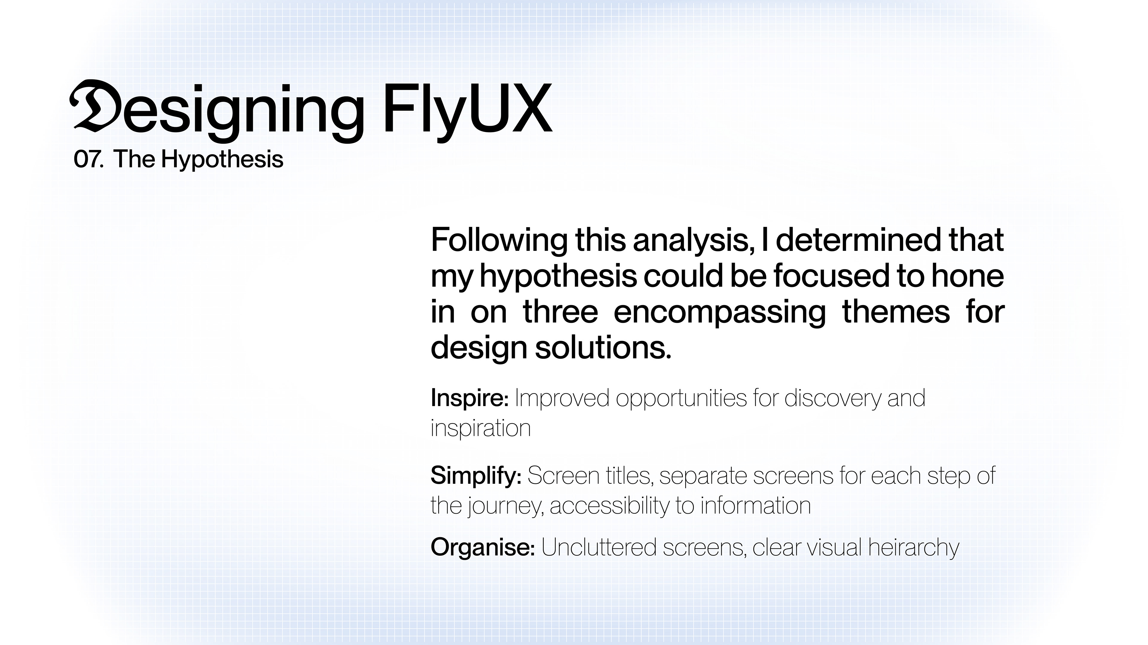
The Overview
FlyUX revolutionizes airline booking with a mobile app designed to provide a visually delightful and seamless user experience, catering to the needs of modern travelers.
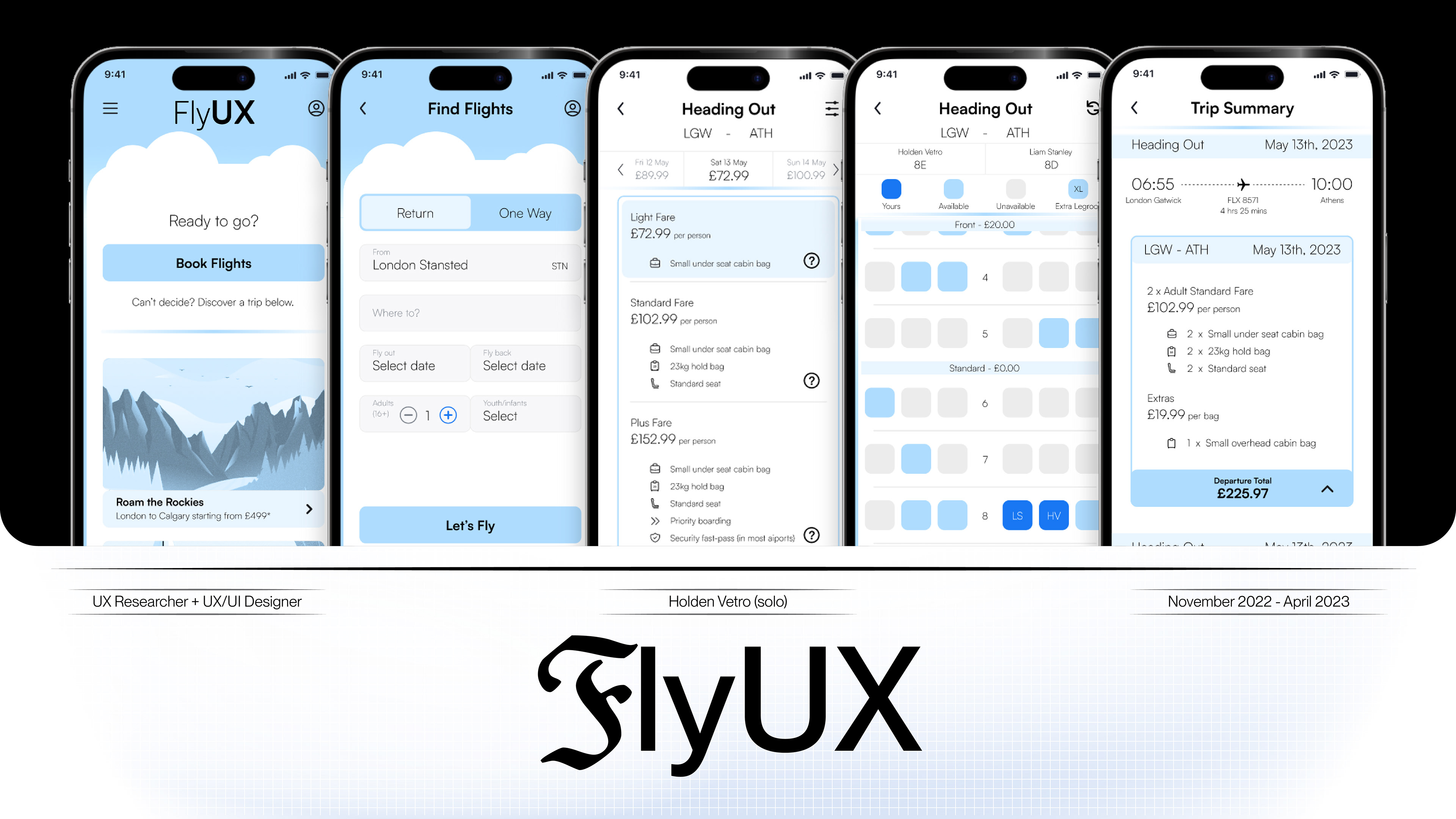
The platform offers intuitive navigation, personalized flight recommendations, and a streamlined booking process that ensures efficiency and convenience. Key features include interactive flight details, real-time updates, and customizable travel itineraries, all aimed at enhancing user engagement and satisfaction. Fly UX’s innovative design prioritizes the user journey from the moment of searching for flights to post-booking support, making travel planning effortless and enjoyable.
The platform offers intuitive navigation, personalized flight recommendations, and a streamlined booking process that ensures efficiency and convenience. Key features include interactive flight details, real-time updates, and customizable travel itineraries, all aimed at enhancing user engagement and satisfaction. Fly UX’s innovative design prioritizes the user journey from the moment of searching for flights to post-booking support, making travel planning effortless and enjoyable.
The Impact
As this project was initiated through my diploma studies, it received a 90% grade from the UX Design Institute. They had this to say:
“Great level of interactivity - all form fields are interactive and clickable. Huge amount of useful and relevant detail. Fully sufficient to test and validate the flow, layout and key interactions, well done. Very professional looking and well considered screen layout. Your design is logical with a clear visual hierarchy.”
“Great level of interactivity - all form fields are interactive and clickable. Huge amount of useful and relevant detail. Fully sufficient to test and validate the flow, layout and key interactions, well done. Very professional looking and well considered screen layout. Your design is logical with a clear visual hierarchy.”
The Work
Discovery:
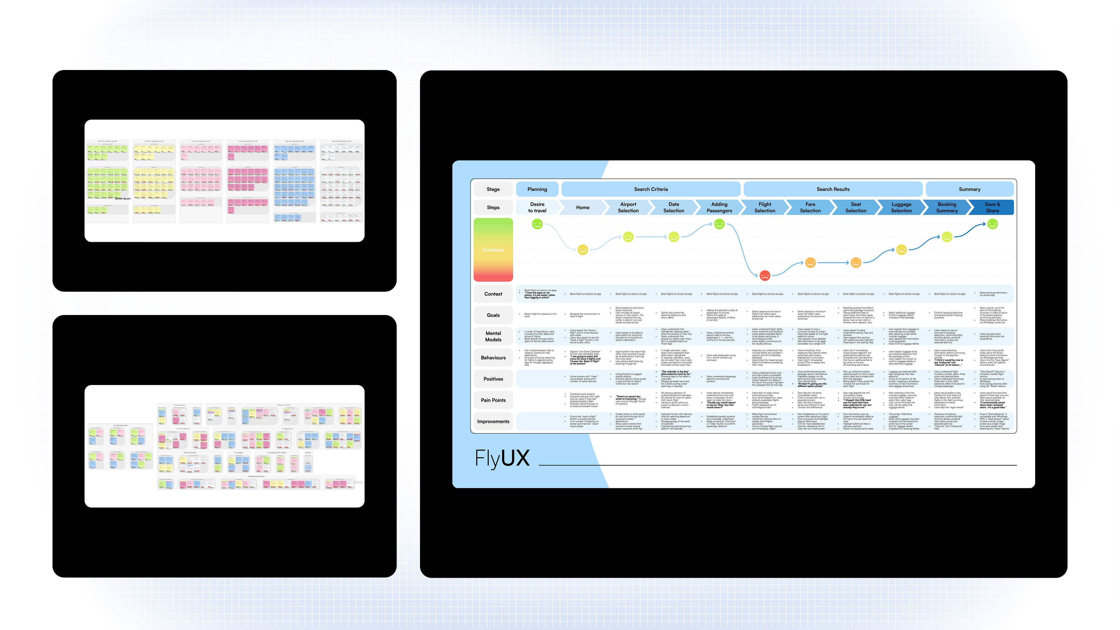
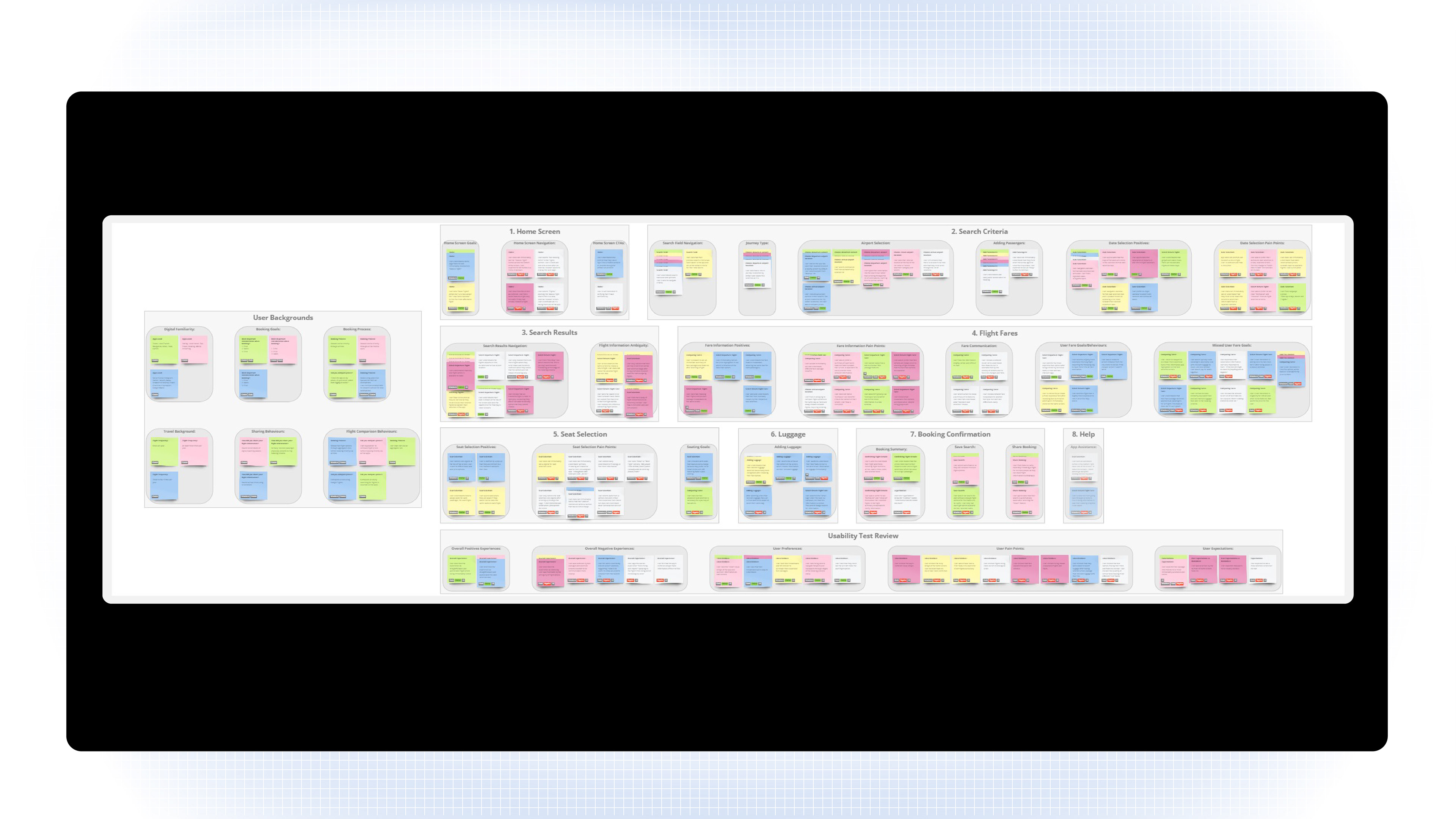
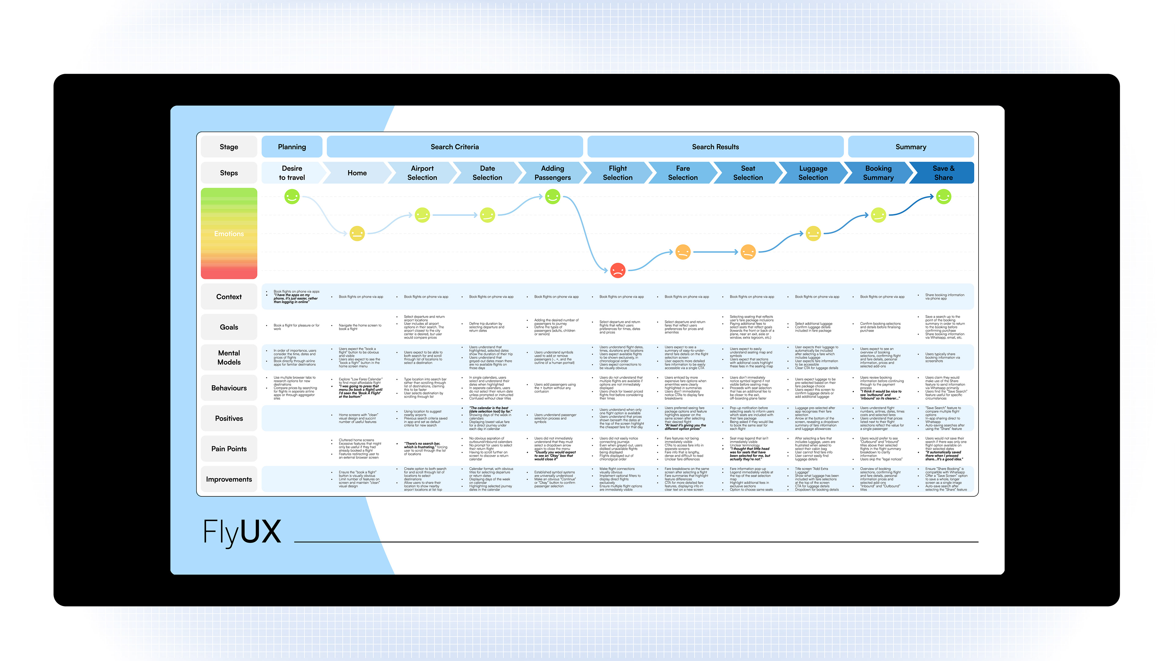
A comprehensive competitor analysis provided a robust understanding of the airline booking landscape to identify industry standards and user expectations. Conducting usability tests with real users revealed specific pain points and preferences, which were then synthesized into actionable insights using affinity diagrams and customer journey maps. Challenges were effectively turned into opportunities for improvement, resulting in a final product that exceeded user expectations as design solutions were rooted in real user needs.
The Project
Brand Perception:
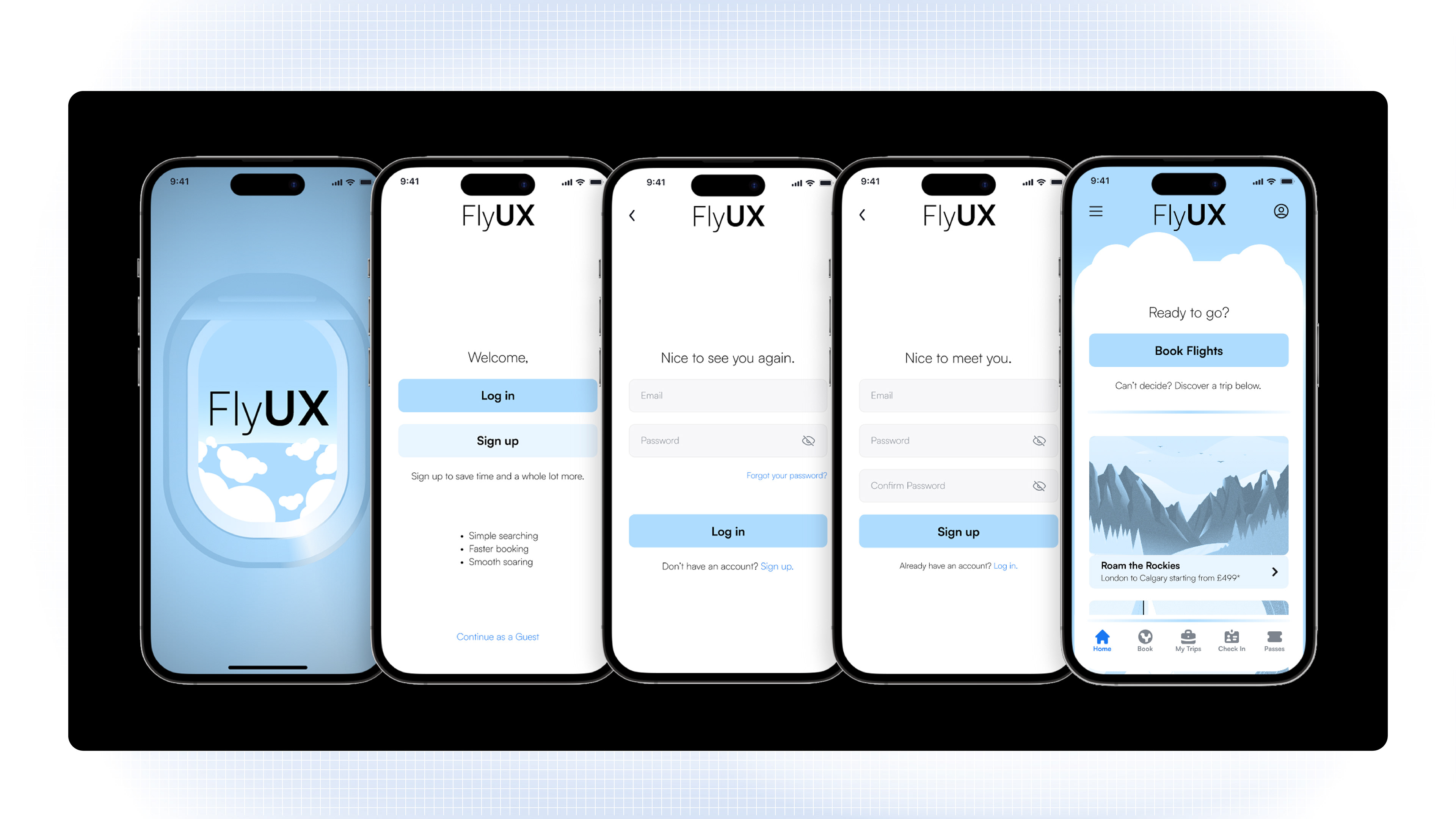
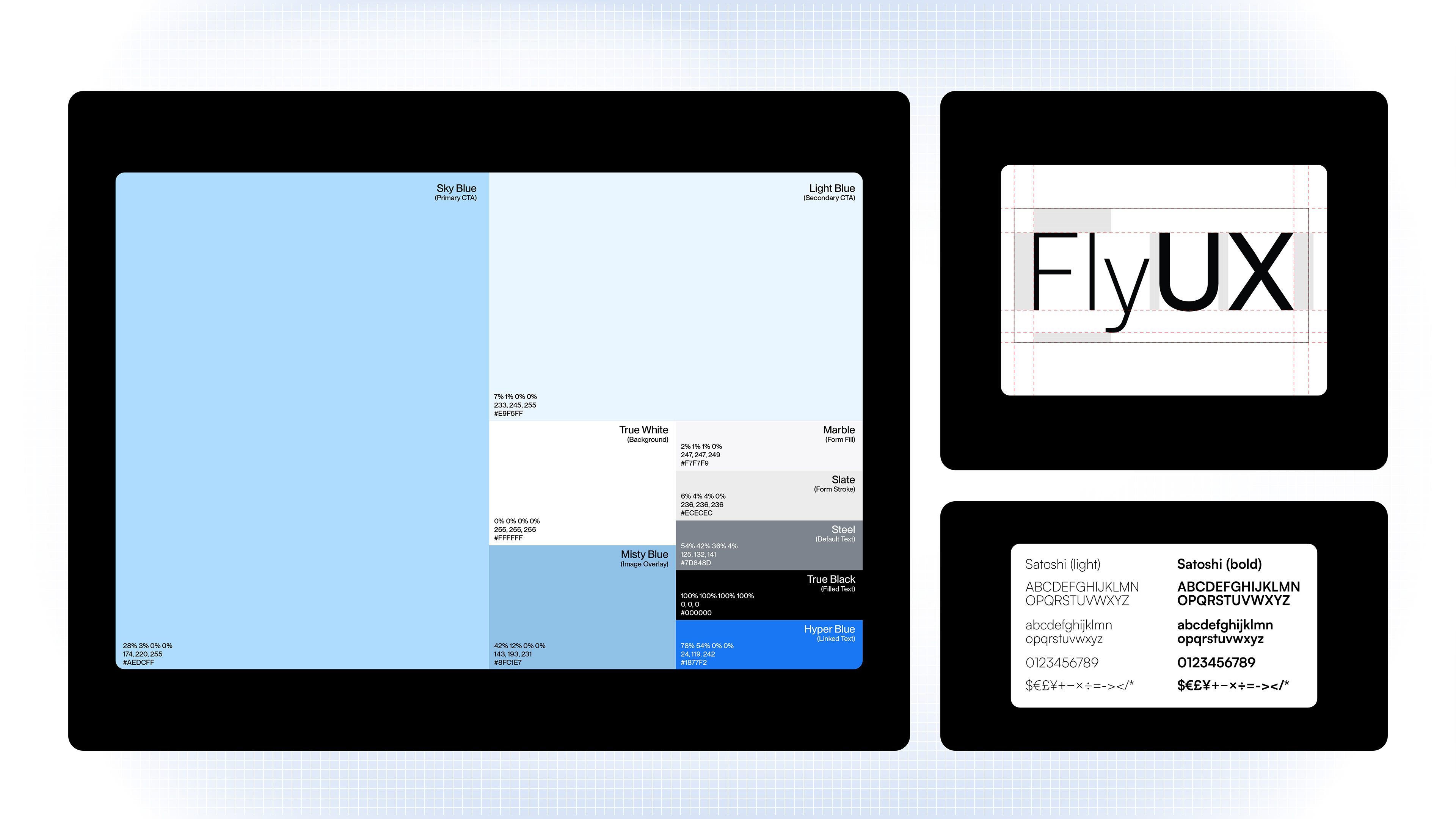
The brand's voice and visual direction were crucial in differentiating FlyUX from its competitors while creating a cohesive and engaging user experience. The psychological underpinning of FlyUX's UI and layout design was to create an intuitive and visually pleasing experience that resonated with users. By leveraging colour psychology, typographic clarity, and strategic use of white space, FlyUX established a brand perception that was trustworthy, calming, and user-centric. This approach not only helped in differentiating FlyUX from its competitors but also ensured that users had a seamless and enjoyable experience from start to finish.
Colour Psychology: The secondary lighter blue (#E9F5FF) was used for dropdown information boxes and secondary CTAs, providing a subtle contrast that guided users intuitively through the booking process. This variation maintained aesthetic harmony while ensuring functional clarity.
Colour Functionality: Additionally, FlyUX used a secondary lighter blue (#E9F5FF) for drop-down information boxes and secondary CTAs. This subtle variation in colour helped differentiate primary actions from secondary information, guiding users intuitively through the booking process. The secondary lighter blue provided a softer visual contrast that maintained the overall aesthetic harmony of the app while ensuring functional clarity.
Typography: The sans serif Satoshi font, used in bold weight for titles and light weight for body text, contributed to a clean, modern aesthetic, enhancing readability and accessibility. Bold titles allowed users to quickly identify key information, while lighter text weight kept the interface open and easy to navigate.
Layout: Strategic use of white space prevented clutter and improved focus, reducing cognitive load. This design choice made the app more intuitive and user-friendly, allowing users to process information efficiently and navigate seamlessly.
Tone of Voice: FlyUX's brand tone was succinct, friendly, and personable, mirroring its visual aesthetic and mission. The copy balanced warmth and approachability with professionalism, while maintaining clarity, fostering trust and reliability throughout the booking journey. This tone of voice complemented the clean visual design, enhancing brand perception and customer loyalty.

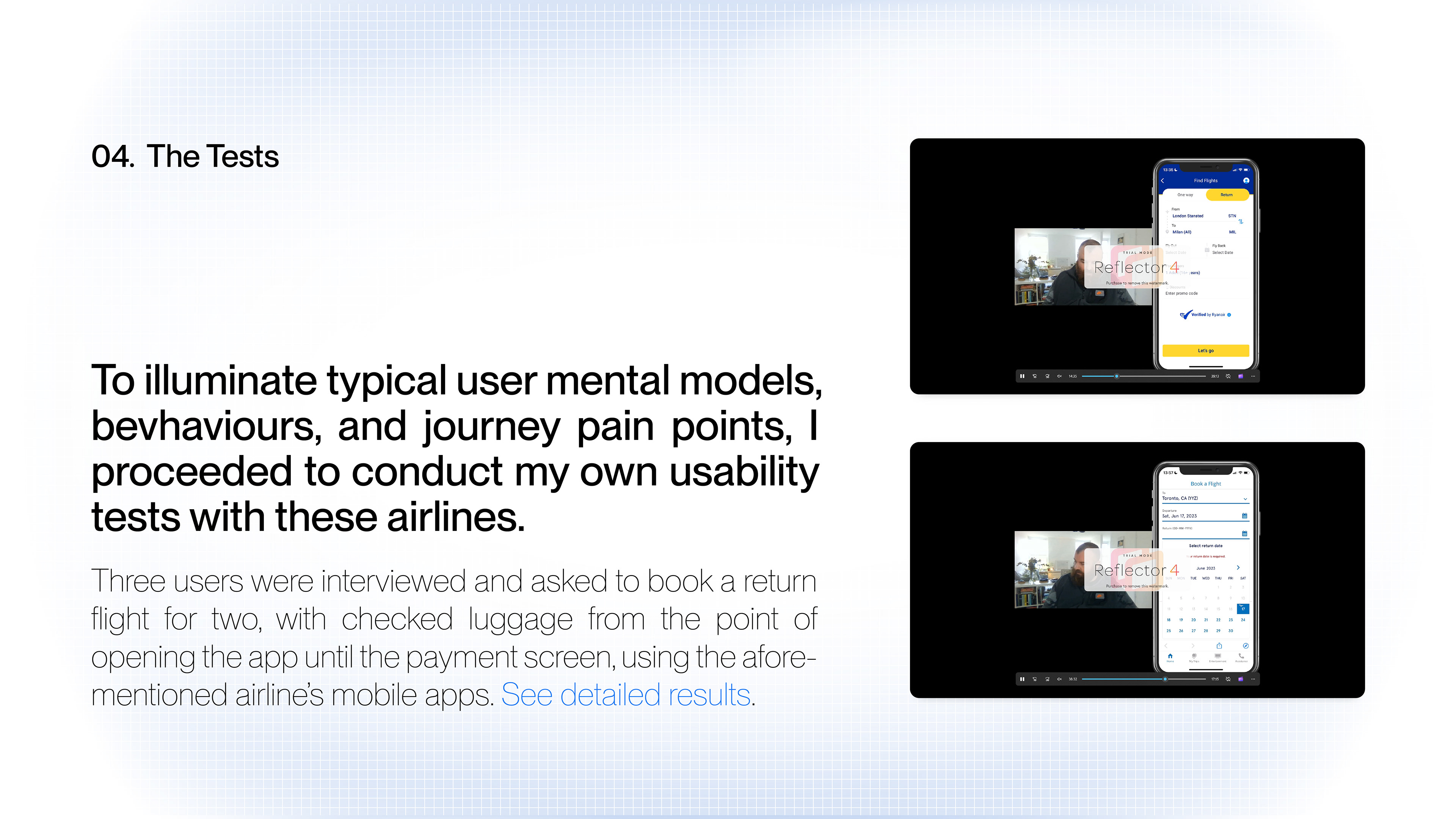
Usability Testing & Insights:
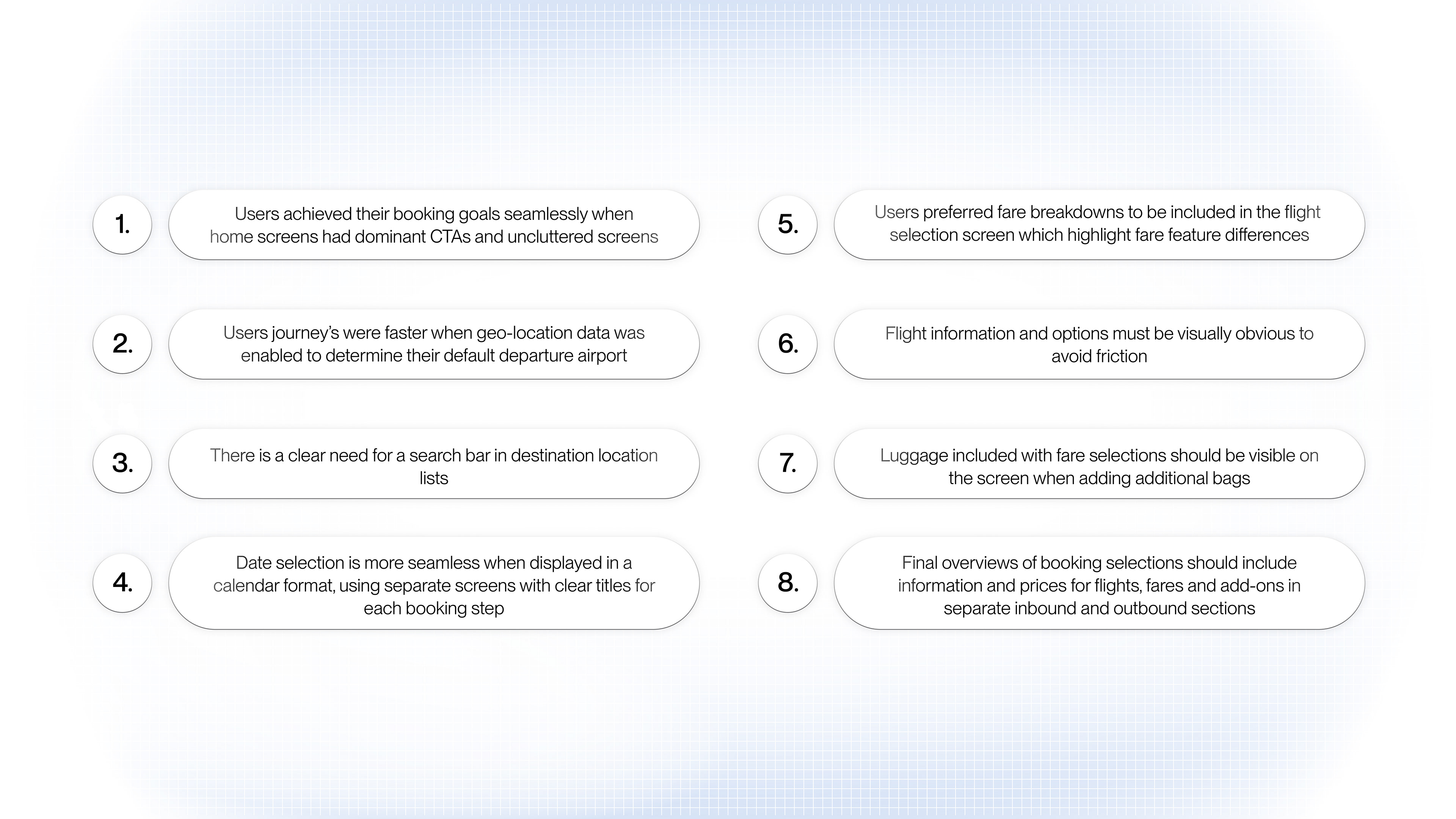
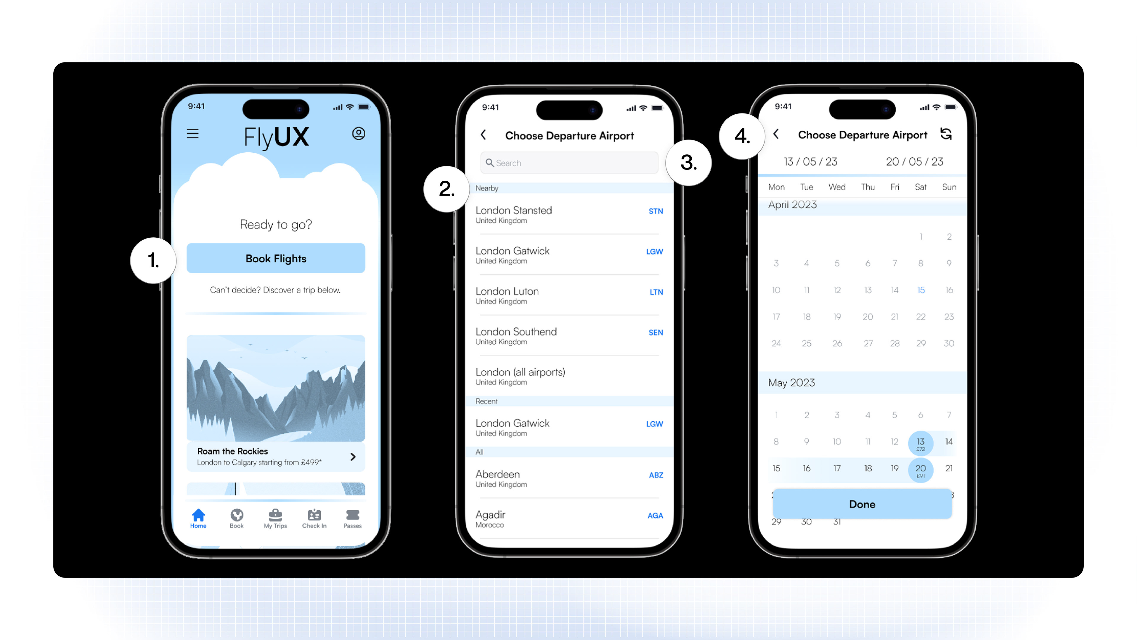
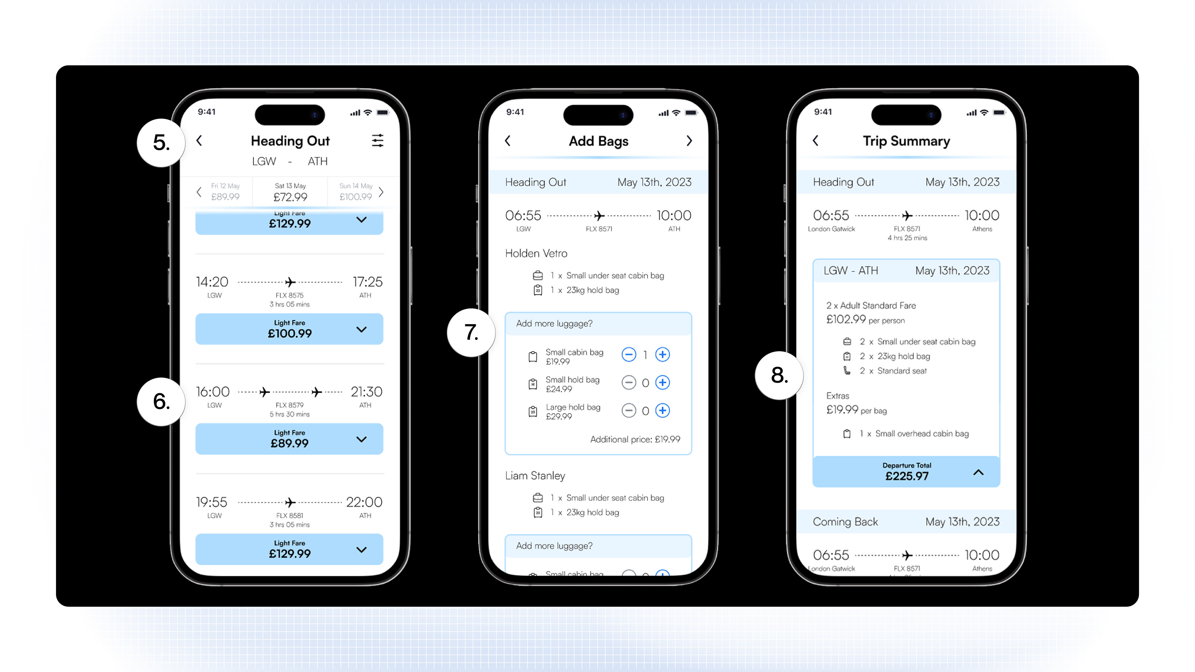
Extensive research and usability testing were leveraged to create an engaging and seamless booking experience. Conducting thorough usability tests highlighted critical areas for improvement, such as the need for clear CTAs, geo-location for departure airports, and simplified date selection. Analyzing and interpreting usability data produced meaningful insights and sharpened my skills in research and testing methodologies, as well as translating data into design improvements and user-friendly interfaces.
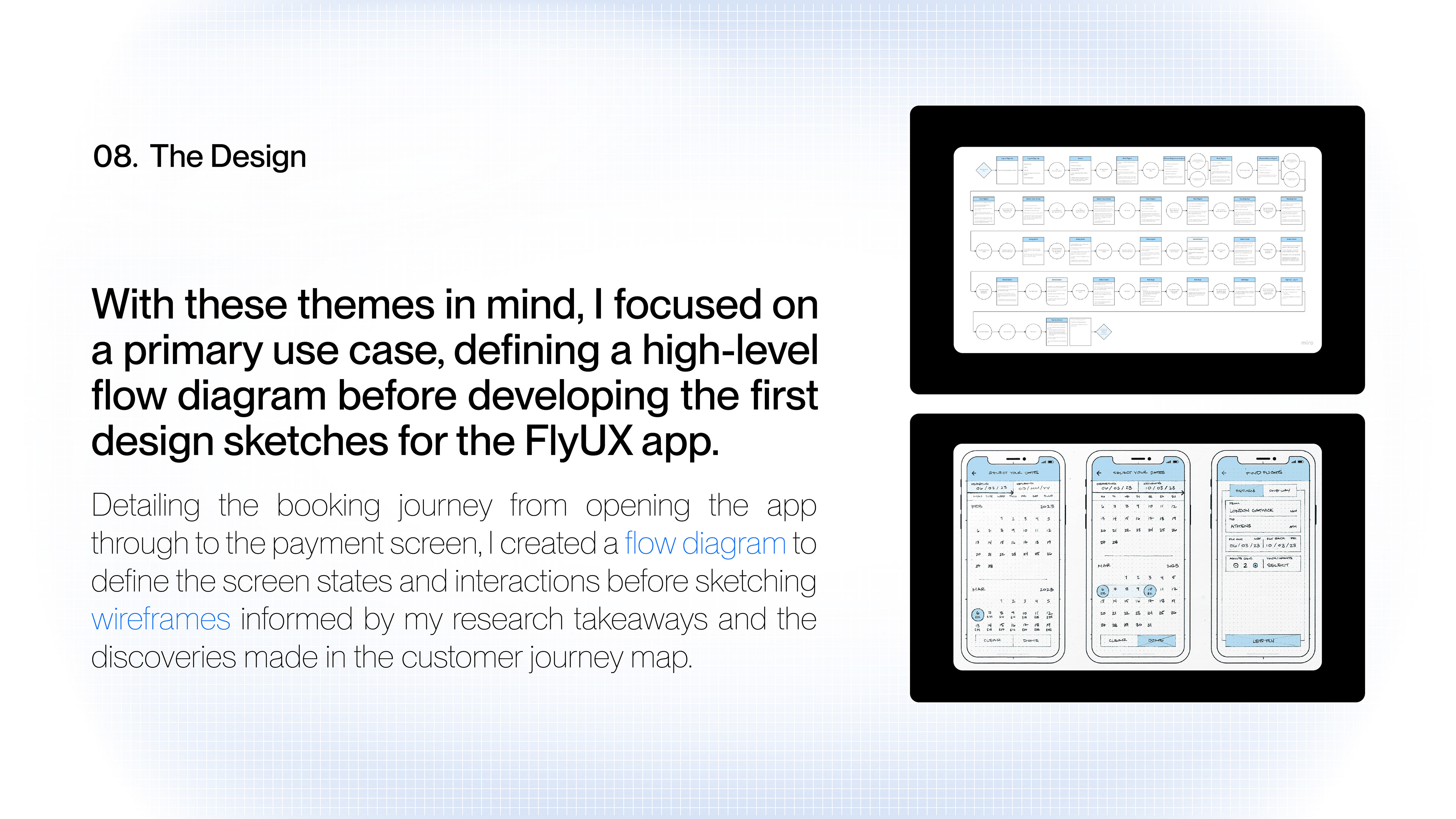
User Flow Improvements:
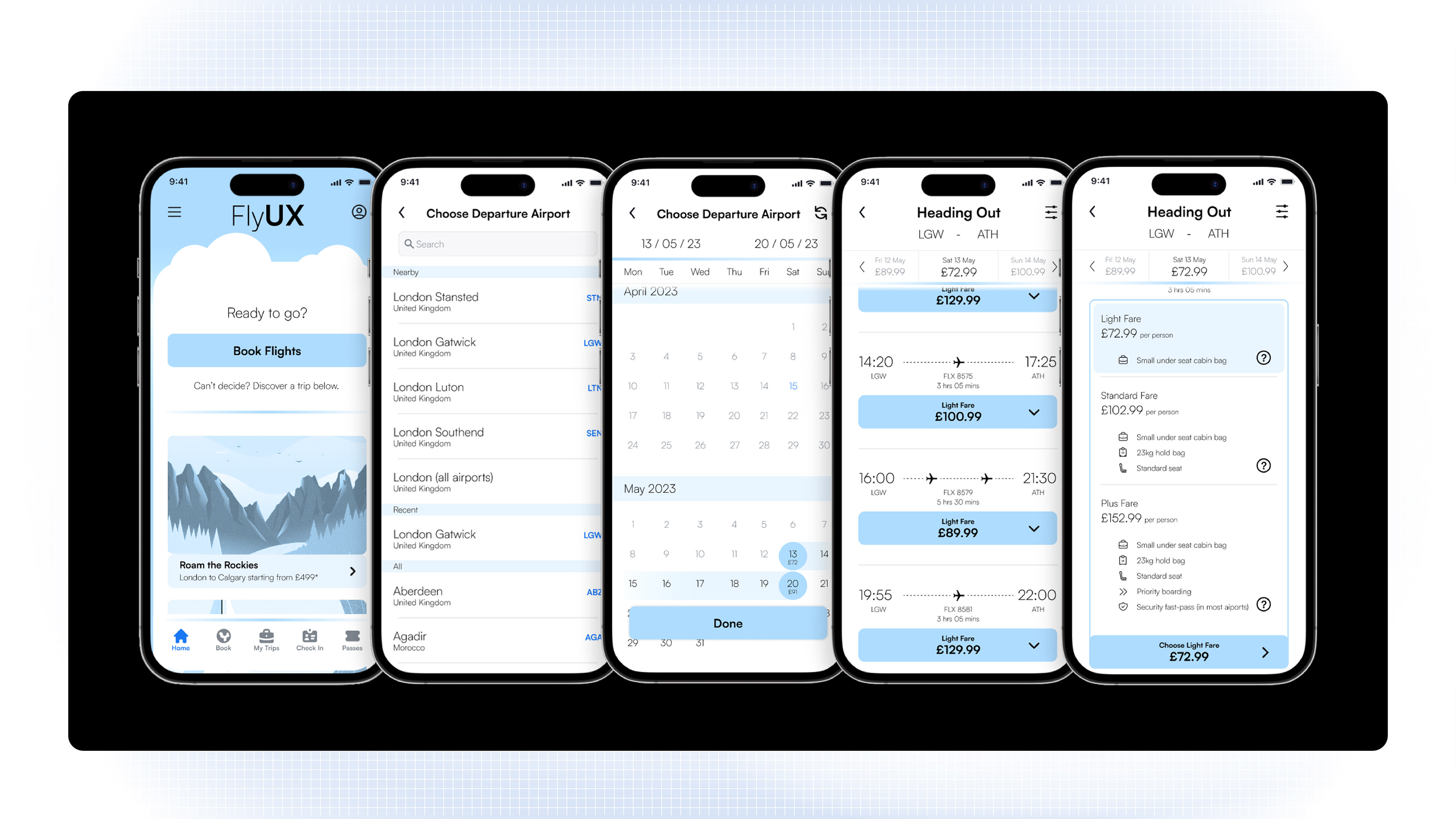
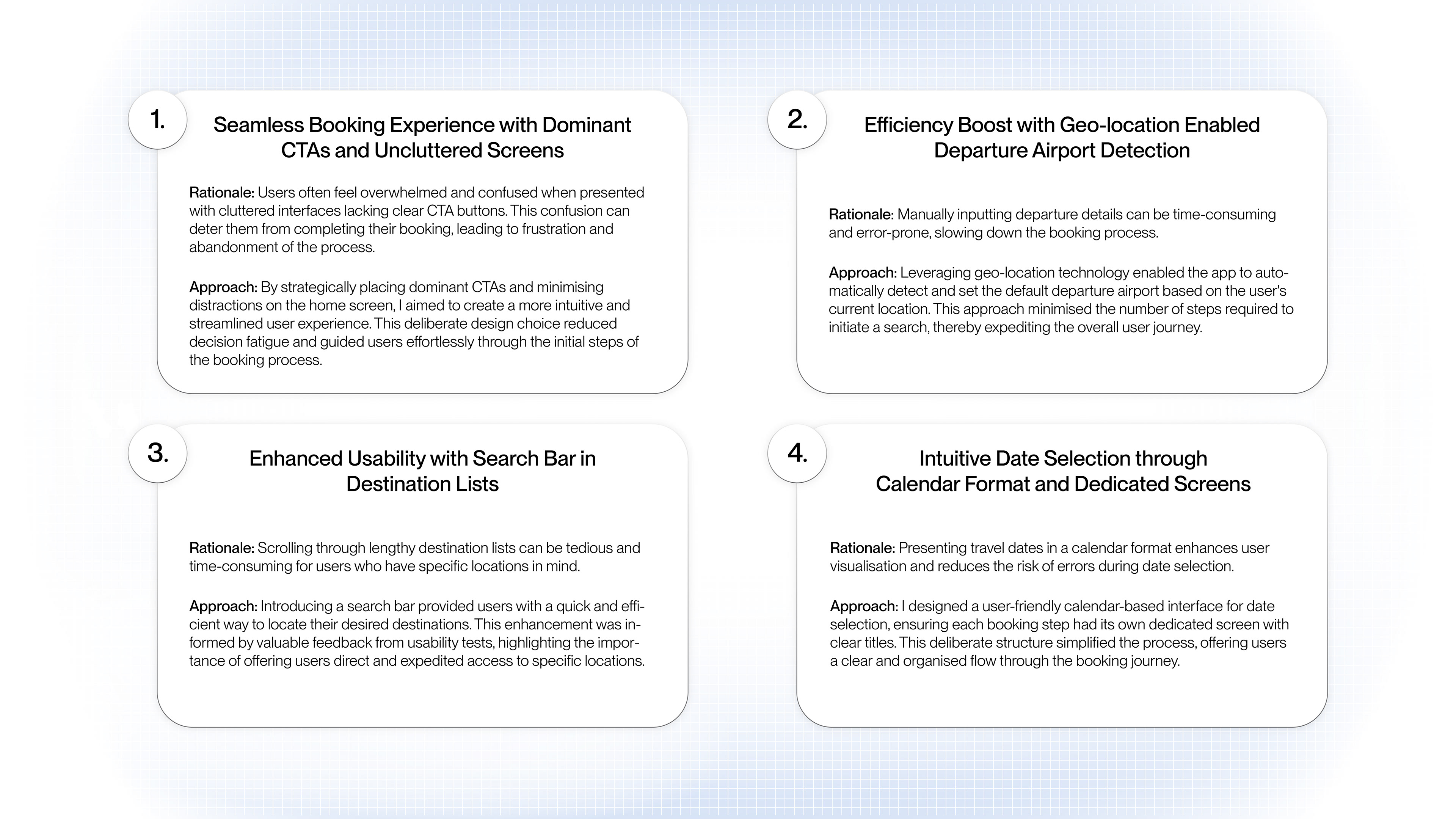
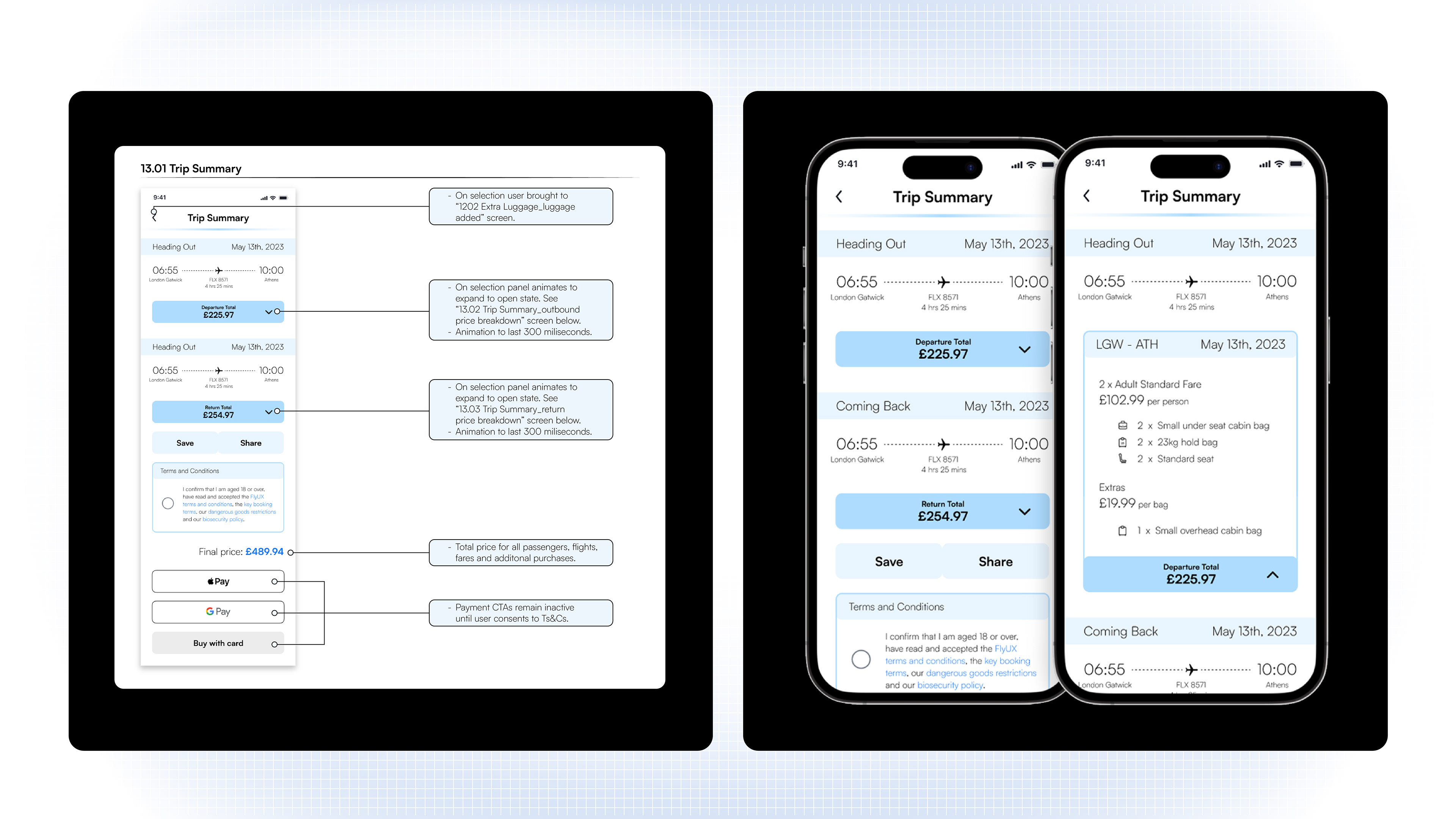
After defining a flow diagram, I sketched wireframes, designing a home screen with dominant CTAs and an uncluttered layout, which significantly improved user satisfaction. Enabling geo-location features to automatically set the default departure airport and sped up the booking process, further enhancing the user experience. The challenge was to balance feature richness with simplicity, ensuring that users were not overwhelmed. I set clear interaction parameters through detailed annotations to further optimise the user's flow.
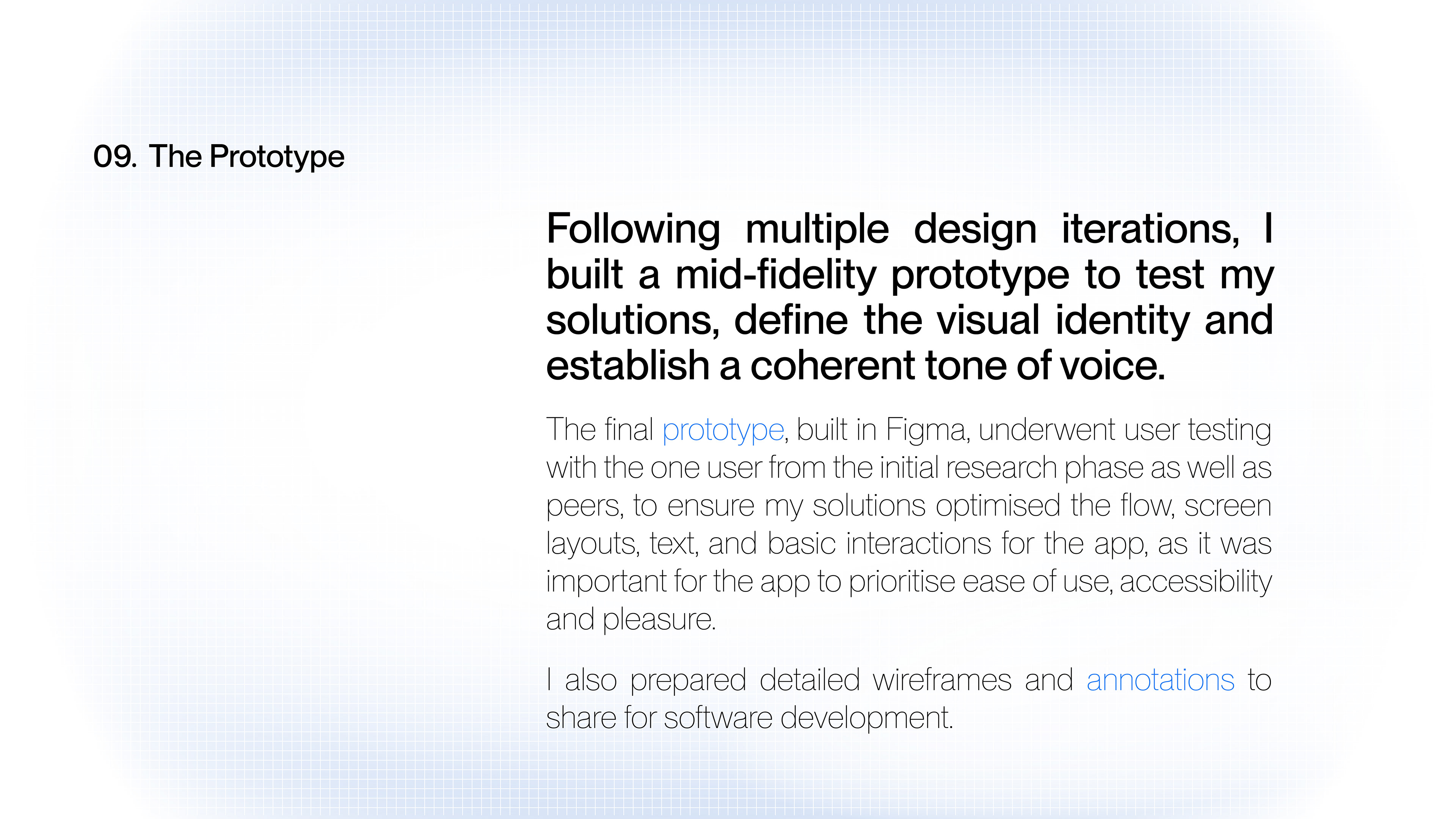
Turning Problems into Wins:
I transformed user pain points into opportunities for improvement, such as implementing clear screen titles and separate screens for each booking step. The prototype was rigorously tested and iterated upon, ensuring that the final product met user needs and expectations. The iterative design process required multiple rounds of testing and refinement, but it was essential for optimising the user experience.


The Reflection
Successes:
A Seamless Experience: FlyUX addressed common issues that make flight booking difficult and uninspiring, developing solutions that ensured quicker, frictionless, and intuitive navigation.
User Engagement and Conversion: By focusing on user needs and preferences, the project could achieve higher engagement and conversion rates. Simplifying the booking process with features like dominant CTAs, geo-location capabilities, and clear, uncluttered screens would lead to a more streamlined, user-friendly experience.
Enhanced Brand Perception: FlyUX's friendly and visually delightful design could resonate with users, differentiating the brand in a competitive market. Aligning the visual design and tone of voice throughout the journey ensured a cohesive and engaging user experience, enhancing the brand's presence and impact.
Adapting to Challenges:
Limited Participants: Balancing the diverse needs of users across different airlines required extensive research and testing. As the participant pool was limited, this challenge was met by testing multiple iterations of prototypes in various stages of developments to record and proceed with the most successful design solutions.
Data Interpretation: Analyzing and interpreting diverse usability data was a significant challenge. However, by refining my analysis methods and frequently testing design iterations, I successfully transformed user feedback into actionable design improvements.
Standing Out: Aligning the app’s visual design with the brand’s mission while ensuring it stood out in the oversaturated market required creativity and strategic thinking. Adjusting the visual design strategy and incorporating user feedback helped strike this balance, resulting in a distinctive and appealing brand identity.
Amendments:
After reviewing the final prototype months after the product launch, I would implement the following changes to improve the app:
Expanded Research Scope: Increasing the number of users included in both the research and prototype testing phases would to help identify more universal goal and behavioural trends, not limited to the happy path.
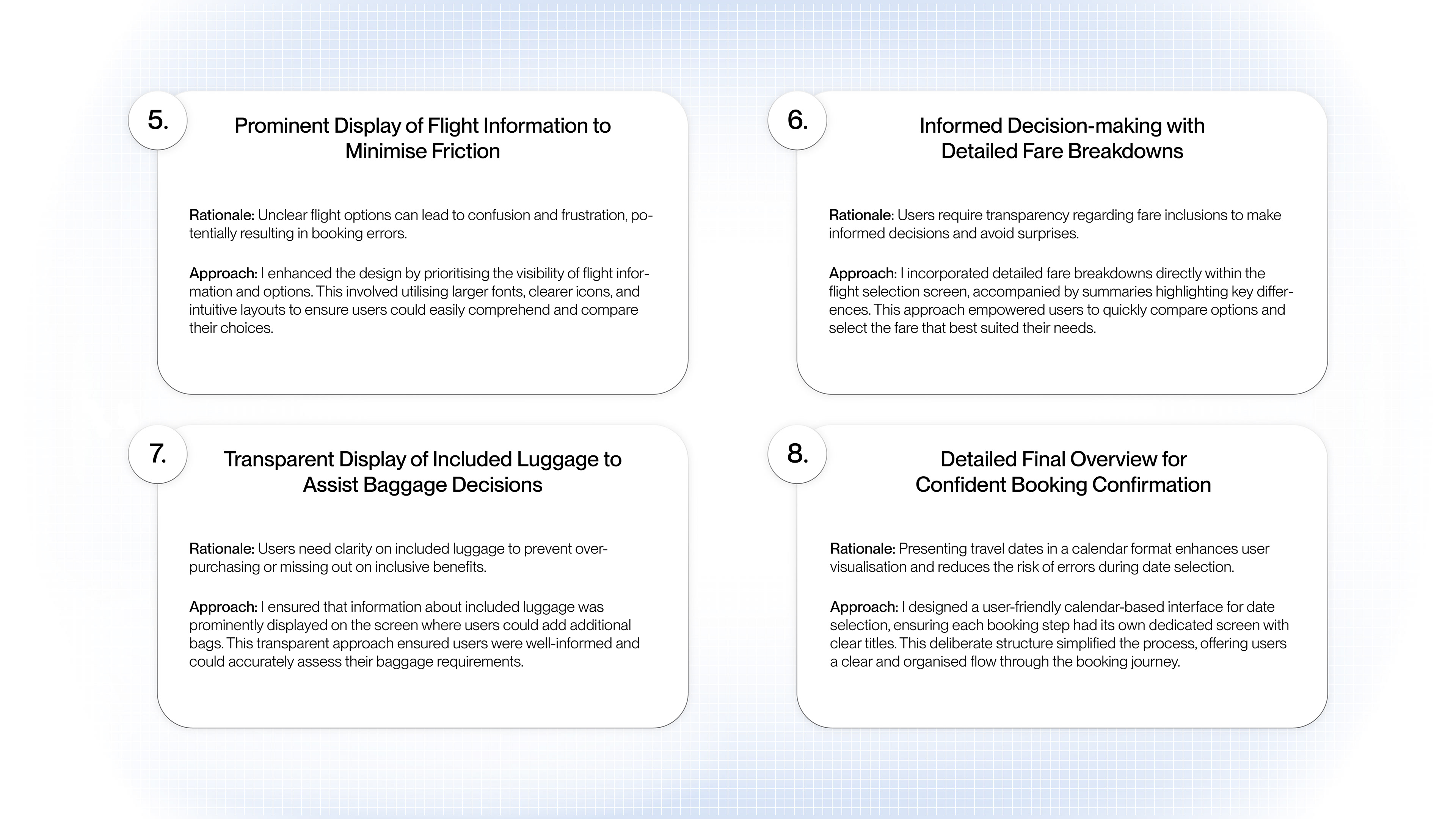
Balancing User and Business Goals: On the “Add Luggage” screen, I would now replace the “Skip Step” chevron icon with a “Detailed Luggage Info” screen which could detail requirements and restrictions on luggage allowances. While impacting the flow speed, this change would require the user to scroll to the bottom of the screen to continue, encouraging additional luggage sales.
Expanded Research Scope: Increasing the number of users included in both the research and prototype testing phases would to help identify more universal goal and behavioural trends, not limited to the happy path.
Balancing User and Business Goals: On the “Add Luggage” screen, I would now replace the “Skip Step” chevron icon with a “Detailed Luggage Info” screen which could detail requirements and restrictions on luggage allowances. While impacting the flow speed, this change would require the user to scroll to the bottom of the screen to continue, encouraging additional luggage sales.
Skills Developed:
User-Centric Design: Rigorous user testing refined my approach, enhancing performance metrics and fostering innovation.
Strategic Product Development: Leading the app from initial concept to final product honed my strategy skills, aligning with market needs to achieve product-market fit.
Brand Development: Evolving the app's identity highlighted the importance of a bold, adaptable brand in standing out digitally.
Innovative Thinking: Pioneering user-friendly and visually appealing design elements broadened my innovation skills, challenging traditional booking norms. or read the full case study below. Select an image from the case study to see relevant, detailed documents:
Try the prototype here, or read the full case study below. Select an image from the case study to see relevant, detailed documents:


View the next case study →